2009年,W3C 提出了一种新的方案----Flex 布局,可以简便、完整、响应式地实现各种页面布局。目前,它已经得到了所有浏览器的支持,这意味着,现在就能很安全地使用这项功能。
一、Flex 布局是什么?
Flex 是 Flexible Box 的缩写,意为"弹性布局",用来为盒状模型提供最大的灵活性。
任何一个容器都可以指定为 Flex 布局。
.box{
display: flex;
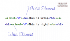
}行内元素也可以使用 Flex 布局。
.box{
 display: inline-flex;
}
Webkit 内核的浏览器,必须加上-webkit前缀。
.box{
 display: -webkit-flex; /* Safari */
 display: flex;
}
注意,设为 Flex 布局以后,子元素的float、clear和vertical-align属性将失效。
二、常用布局
公共样式:
  <style>
    * {
      margin: 0;
      padding: 0;
    }

    .has-flex {
      display: flex;
    }
  </style>
垂直居中 子元素左右分布
css
    .father-one {
      width: 100%;
      height: 200px;
      background-color: #fffcef;
      align-items: center; /*纵轴)方向上的对齐方式。*/
      justify-content: space-between; /* 均匀排列每个元素 首个元素放置于起点,末尾元素放置于终点,中间元素的中间间隔相等 */
      justify-content: space-around; /* 均匀排列每个元素 每个元素周围分配相同的空间 */
      justify-content: space-evenly; /* 均匀排列每个元素  每个元素之间的间隔相等 */
    }

    .fa-one-child1 {
      height: 30px;
      width: 30px;
      background-color: #a6acde;
    }

    .fa-one-child2 {
      height: 40px;
      width: 40px;
      background-color: #e4b9f0;
    }

    .fa-one-child3 {
      height: 50px;
      width: 50px;
      background-color: #f3b009;
    }

    .fa-one-child4 {
      height: 60px;
      width: 60px;
      background-color: #f77c4f;
    }
html
<!--垂直居中 子元素左右分布 star-->
<h3>垂直居中 子元素左右分布</h3>
<div class="father-one has-flex">
  <div class="fa-one-child1"></div>
  <div class="fa-one-child2"></div>
  <div class="fa-one-child3"></div>
  <div class="fa-one-child4"></div>
</div>
<!--垂直居中 子元素左右分布 end-->
水平垂直居中
css
    .father-two {
      width: 100%;
      height: 200px;
      align-items: center; /*纵轴)方向上的对齐方式。*/
      justify-content: center; /*  横轴)方向上的对齐方式*/
      background-color: red;
    }

    .child {
      width: 50%;
      height: 60px;
      background-color: rosybrown;
    }
html
<!--水平垂直居中 star-->
<h3>水平垂直居中</h3>
<div class="father-two has-flex">
  <div class="child"></div>
</div>
<!--水平垂直居中 end-->
水平垂直居中 图标在上文字在下
css
    .father-three {
      height: 80px;
      background-color: #f77c4f;
      align-items: center;
      justify-content: center;
      flex-direction: column;
    }
html
<!--水平垂直居中 图标在上文字在下 star-->
<h3>水平垂直居中 图标在上文字在下</h3>
<div class="has-flex father-three">
  <i class="fa fa-file-text-o" aria-hidden="true"></i>
  <p>测试</p>
</div>
<!--水平垂直居中 图标在上文字在下 end-->
子元素平分父元素,且自适应等高
css
    .father-four {
      background-color: #ffd5eb;
    }

    .fa-four-child {
      flex: 1;
      text-align: center;
      background-color: #ffffff;
      border: 1px solid;
    }
html
<!--子元素平分父元素,且自适应等高  star-->
<h3>子元素平分父元素,且自适应等高 </h3>
<div class="has-flex father-four">
  <div class="fa-four-child">第一个</div>
  <div class="fa-four-child">第二个</div>
  <div class="fa-four-child">第三个</div>
  <div class="fa-four-child" style="height: 90px">第四个</div>
</div>
<!--子元素平分父元素,且自适应等高 end-->
子元素平分父元素,两边对齐中间自适应相同宽度间隔,且自动换行
css
    .father-five {
      height: 100px;
      background-color: #a6acde;
      justify-content: space-between;
      flex-wrap: wrap;
    }

    .fa-five-child {
      width: 21%;
      background-color: #f77c4f;
    }
html
<!--子元素平分父元素,两边对齐中间自适应相同宽度间隔,且自动换行  star-->
<h3>子元素平分父元素,两边对齐中间自适应相同宽度间隔,且自动换行 </h3>
<div class="has-flex father-five">
  <div class="fa-five-child">第一个</div>
  <div class="fa-five-child">第二个</div>
  <div class="fa-five-child">第三个</div>
  <div class="fa-five-child">第四个</div>
  <div class="fa-five-child">第五个</div>
  <div class="fa-five-child">第六个</div>
  <div class="fa-five-child">第七个</div>
  <div class="fa-five-child">第八个</div>
</div>
<!--子元素平分父元素,两边对齐中间自适应相同宽度间隔,且自动换行 end-->
三栏布局,两边固定宽中间自适应
css
    .father-six {
      height: 100px;
    }

    .one-child,
    .three-child {
      width: 300px;
      background-color: #a6acde;
    }

    .two-child {
      flex: 1;
      background-color: #eeeeee;
    }
html
<!--三栏布局,两边固定宽中间自适应  star-->
<h3>三栏布局,两边固定宽中间自适应 </h3>
<div class="has-flex father-six">
  <div class="fa-six-child one-child">第一个</div>
  <div class="fa-six-child two-child">第二个</div>
  <div class="fa-six-child three-child">第三个</div>
</div>
<!--三栏布局,两边固定宽中间自适应 end-->
到此这篇关于flex(弹性布局)教程之常用布局的文章就介绍到这了,更多相关flex常用布局内容请搜索站长网以前的文章或继续浏览下面的相关文章希望大家以后多多支持站长网!
+1
赞
赏
 分享
分享


